
Custom Pink Square Story Player Interaction Evaluation
A custom pink square story player can give publishers and toy brands a compact physical home for stories, songs or language content. The supplied images show a clear visual direction: square cabinet, round top area, front speaker pattern, silver control and flower detail. The sourcing task is to turn that recognizable object into a coherent starter set and repeatable product range.
The artwork is a concept reference. Card recognition, storage, lighting, battery, connectivity and performance are confirmed only after the project configuration and sample tests are agreed.
Its value begins with a routine families can see, repeat and explain without navigating a general-purpose screen.
Is the flower decoration, feedback or light?
The flower makes the product distinctive and softens the otherwise boxy outline. Buyers can position it as a visual signature, a status element or a gentle light direction, but the final description must match the verified sample. A decorative flower can still add brand value without promising illumination. A lighted version needs an understandable purpose in the listening routine.
Review the flower in normal room light, near a bed and inside the gift box. Look for glare, awkward height, shadow on the card area and pressure from the packaging insert. If it communicates status, use a small number of consistent states. Families should not need a chart to understand whether the player is ready, busy or low on power.
What belongs in the first box?
A good starter set should let a family understand the product on the first evening. The player, initial card assortment, charging item and quick-start material need to work as one pack. A large card count may look generous yet feel random if the stories have no order, age cue or storage method. A smaller themed selection can make the first choice easier and leave a clear path for expansion.
Define the first ten minutes: unbox, prepare the player, choose a card, start audio, adjust sound and put the card away. Review every included item against that sequence. This exercise often reveals a missing card holder, unclear power instruction or unnecessary accessory before packaging artwork is finalized.

A clean hero image sets the visual baseline
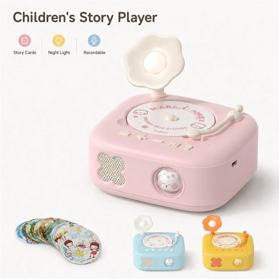
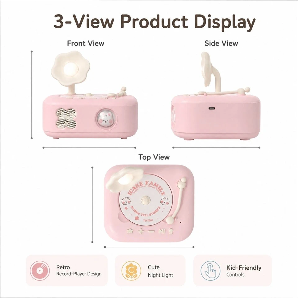
The front photograph is the reference for the pink cabinet, grille boundary, silver control and flower position. Use it for proportion and branding reviews before comparing optional colors or card graphics.
Why is a language edition more than translated print?
Localization affects more than the words printed on a box. Story duration, spoken prompts, card titles, alphabet length and voice level can change. One region may want a bilingual pack; another may prefer separate language editions. Treating localization as a late audio swap can create mismatched cards, crowded artwork and inconsistent navigation.
Build a release sheet for each edition with card list, artwork version, audio master, prompt set, package copy and approval owner. Test several short and long tracks on the actual player. The family should hear a consistent level and voice direction even when files come from different studios or publishing partners.
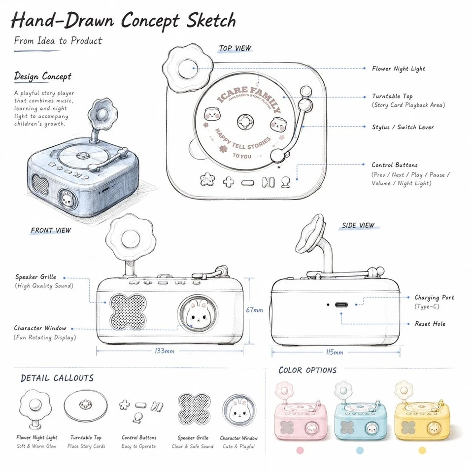
Mark up the sketch before artwork begins
This drawing is useful for comments on cabinet shape, top-circle size, flower height and front balance. Early visual corrections protect later card, logo and box artwork from avoidable rework.

Why does the front still read at thumbnail size?
The broad square cabinet provides a clean visual field. Speaker perforations occupy the left side, while a silver circular control sits on the right. Their balance is part of the product's shelf recognition. A large logo, dense printed icons or an oversized grille revision can make the face feel busier than the supplied concept.
Prepare front-view mockups at actual size and at online-thumbnail size. Check whether the flower, round top area and square silhouette still read before small text becomes visible. Keep essential symbols close to the related control, and move explanations to the card, quick-start sheet or package rather than turning the cabinet into an instruction panel.
Will the stories sound comfortable in a real room?
A children's story player is heard in bedrooms, living rooms and classrooms, not only in a quiet sample room. Spoken words should remain clear at comfortable volume without turning the front grille into a harsh, bright source. Music, narration and prompts may arrive from different producers, so the content set needs consistent mastering as well as capable hardware.
Use the intended cabinet and several representative tracks. Listen from the front, the side and across a small room. Place the unit on wood and fabric to reveal changes in vibration. Record the approved audio package with the sample revision; do not transfer volume or runtime claims from a different enclosure.

Keep variants inside one assortment plan
Color, card and packaging options work best when the hero version is already clear. Each approved variant should have its own artwork record while sharing the confirmed product platform.
What would a shop assistant call this product?
This product reads as a small pink gramophone, not a general-purpose speaker. That identity gives a buyer a useful starting point: decide whether the range is sold as a bedtime story player, a publisher's card library, a language-learning set or a gift item with audio content. Each route changes the front-of-box message, the number of cards in the first pack and the reason a family returns for more content.
Write one sentence that a shop assistant could say without opening an app or engineering document. Then select only the visible actions needed to support that sentence. The result becomes a filter for every later option. If a proposed function cannot be explained within the chosen retail story, keep it out of the first configuration.
Which six photographs settle an appearance review?
Supplier and buyer can reduce subjective feedback by using the same views for every sample. For this square player, front, left, right, top, three-quarter and packed views cover the details most likely to drift. Keep camera distance and lighting similar, and place the approved sample beside the new one when practical.
Mark visible differences directly on the comparison sheet: cabinet width, flower lean, deck position, grille boundary, control spacing and color. This is faster than comments such as "make it more balanced." When a change is accepted, update the reference set so the next sample is not compared with an obsolete render.
Where will a child place the story card?
The circular top element looks like a stage for a story card or disc. Its graphic treatment should make the intended placement easy to discover. A decorative ring, printed alignment cue or shallow boundary can guide the hand, but it should not imply a moving turntable unless the approved product actually moves. The visible design must match the selected recognition method and card construction.
Mock up the top surface with the real card size. Ask an unfamiliar adult and child where the card belongs, which side faces up and when it can be removed. Note the first attempt rather than coaching. Their behavior is more useful than adding another arrow after the layout has already confused them.
The room scene tests the promise
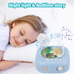
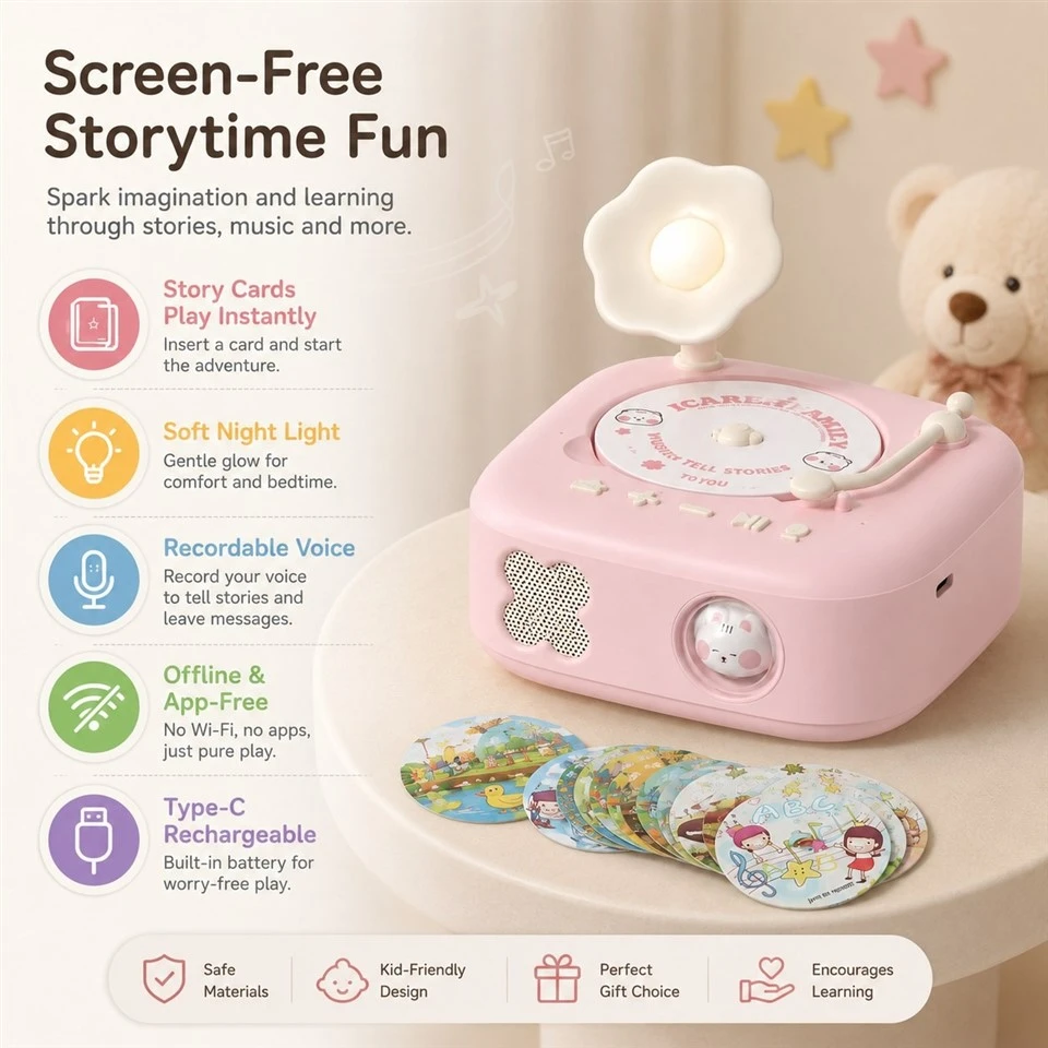
A bedroom setting helps buyers judge bedside scale, viewing angle and whether the physical card routine feels calm. It does not prove any hidden lighting, battery or recognition function.

What is included in the quotation-and what is not?
A useful quotation separates color, logo, cards and packaging from the player architecture, content preparation and any software work. This prevents a discussion of possible options from becoming an accidental promise. It also helps buyers compare proposals that use different recognition or storage approaches without assuming the lowest line price includes the same scope.
Ask each quotation to name the base configuration, buyer-supplied items, factory-developed items, optional work and items still awaiting confirmation. Commercial quantities and timing should follow the agreed version rather than a generic concept. A clear scope is more valuable than a crowded feature table built before responsibilities are known.
Three views support a consistent handover
Front, side and top references help packaging, photography and inspection teams discuss the same square body. Use production-intent views rather than allowing early concept proportions to remain the only reference.

What will families assume the silver dial does?
A prominent dial creates an expectation of direct control. Volume is the most familiar use, although the actual function remains a project choice. Combining press, rotation and long-press actions can save components but make the product harder to explain. The right solution depends on user age, the number of modes and whether adults or children make adjustments during a story.
Create a label-free handling check. Let users approach the sample without instructions and record what they try. If most users turn the part, its primary function should reward that gesture. Confirm that ordinary force does not move the cabinet, and keep the chosen behavior identical across packaging, prompts and the manual.

Visible features need plain-language roles
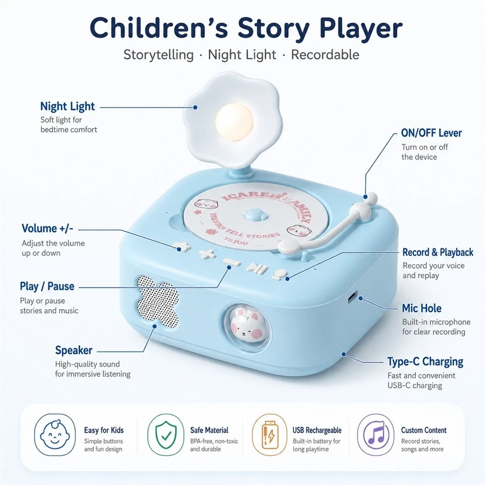
The detail board groups speaker, control, top deck and flower. For a retail-ready story player, every callout should match a function shown on the approved sample and described the same way on packaging.
What should the pilot reveal before the order grows?
The pilot stage should combine the chosen cabinet, controls, content set, cards, labels and packaging. It is the first time the order can be reviewed as a retail unit rather than a sequence of specialist samples. Variation across several units matters more than the best individual piece.
Check card-to-audio mapping, control response, sound, charging behavior, visible finish, pack completeness and carton recovery with recorded criteria. Keep the approved unit and documents together. If a material, component or file changes later, review the affected checks rather than assuming the old approval covers the new order.
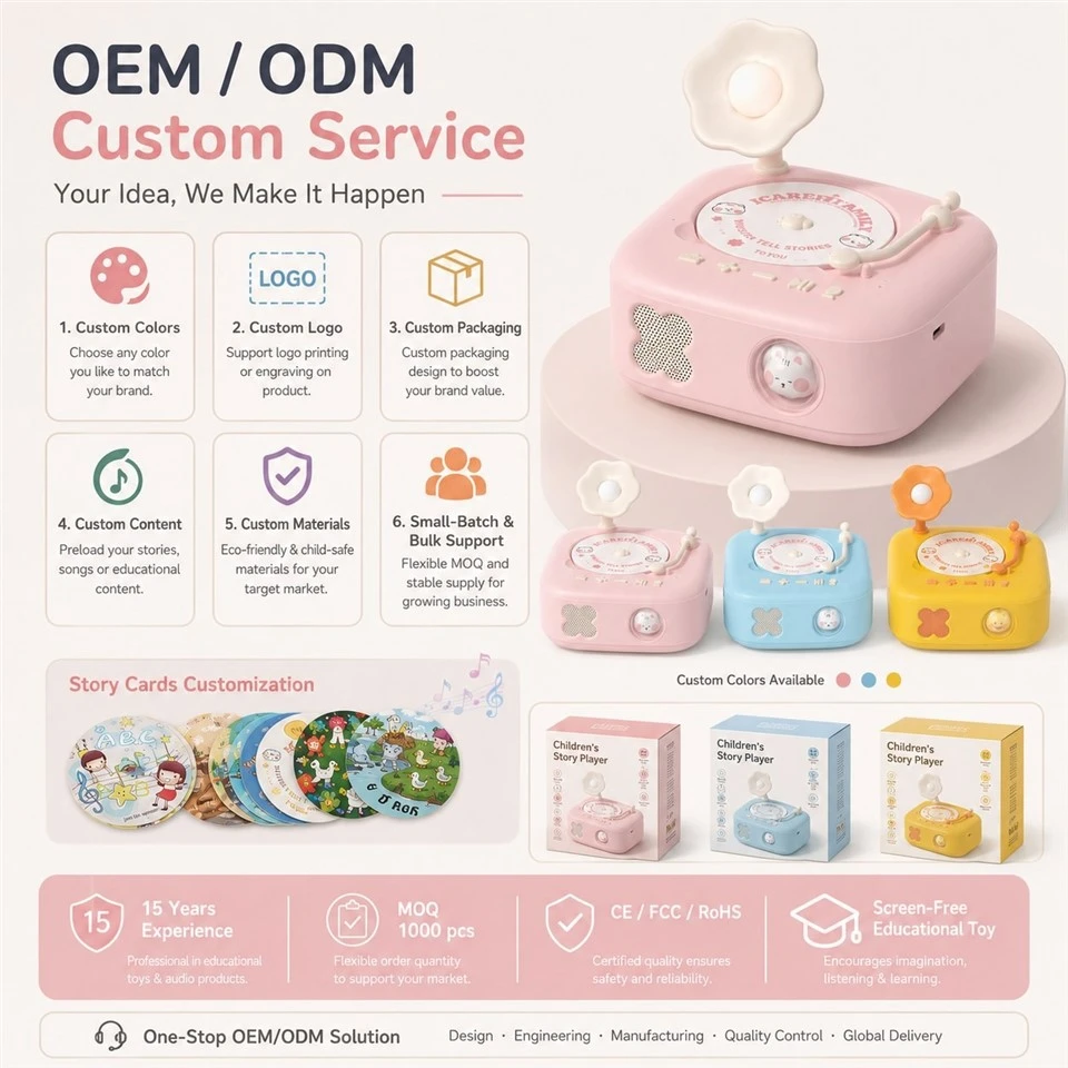
When I compare the six supplied images, the front view and the sketch do the most useful work: one preserves the friendly pink face, while the other keeps proportions open for discussion. The scene image is valuable for scale, and the later boards belong in customization and handover reviews. That sequence is why the pictures are spaced through the page instead of treated as a gallery.
Where do the cards go after storytime?
Printed story media creates a visible library. Color bands, characters, numbers or theme marks can help children browse without reading every title. The system also needs a place to live after unboxing. Thin cards save space but disappear easily; thick pieces can be easier to handle while increasing carton depth and expansion-pack cost.
Lay out the starter set and two future packs together. Check whether a parent can separate languages or themes and whether a child can return a favorite card. Reserve a stable area for title, artwork and any required identifier. A card design that works for one story should remain usable when the catalogue grows.
How many colors does the range actually need?
The customization board shows how color can change the mood while the square form remains recognizable. A brand may want one main pink version, two regional colors or a coordinated family of players. Too many early variants divide attention across samples and make color approval harder. Start with the hero color that best communicates the intended shelf position.
Approve molded or finished color samples under warm and cool light, then compare them with card print and box print. These materials use different processes, so identical digital values may not look identical in person. Define acceptable harmony rather than expecting every surface to reproduce one screen color perfectly.
Can the package teach the first action?
The gift box has to protect the raised flower, cabinet finish, control and card set while teaching the first action. A window can show the product, but it should not squeeze the upper feature or leave cards moving freely against the housing. The insert layout also determines which item the customer sees first and whether setup feels playful or technical.
Run an unboxing review with a packed, transported sample. Ask the reviewer to identify included pieces and begin a story without verbal help. Afterward, inspect the flower, surface and controls and repeat playback. A successful package protects both appearance and first use rather than treating them as separate jobs.
Prepare an inquiry that can be priced clearly
Share the target market, intended listening moment, age direction, starter-card quantity, language plan, content ownership, preferred control behavior, hero color and packaging channel. Note whether your team supplies audio, artwork, software or a module. Unknown decisions can remain open for proposal rather than being filled with unsupported assumptions.
For more context on physical media planning, read the published square phonograph card-reading guide. Joy's visual development updates can also help buyers prepare sample comments and reference boards.
FAQ
Q: Does the concept prove that the player uses NFC?
A: No. The images show a card-based interaction direction; recognition technology must be chosen and demonstrated on the intended sample.
Q: Can the starter card set be customized?
A: Yes. Define card size, artwork, themes, languages, audio ownership, mapping and packaging as one controlled content assortment.
Q: Which visible details should remain consistent across variants?
A: Keep the square proportions, top area, flower position, grille boundary and control layout tied to an approved hero reference unless a variant is intentionally redesigned.
Q: What information helps the first quotation?
A: Provide market, user, content plan, languages, desired interaction, customization scope, packaging goal and which assets or technology your team supplies.
Discuss the pink square story player with Joy: WhatsApp +86 13691793052 · E-mail: xdt05@dtdianzi.com.
Hot Tags: custom pink square story player interaction evaluation, China, suppliers, manufacturers, factory, customized, wholesale, bulk, quotation, made in China