What Makes a Pink Plush Character Feel Premium Instead of Generic
Products Description
Pink is one of the easiest colors to notice in a plush collection and one of the hardest to use well. A pink character can feel warm, playful and gift-ready, but it can also disappear into a crowded market if the design depends on color alone. Buyers often begin with a charming rendering and assume the softness will carry the idea. The physical sample quickly shows whether the character has a real identity.
A strong custom pink plush toy needs more than a pleasant shade. Its outline should be recognizable from a distance, the face should have a clear mood, the fabric should support the intended touch, and the construction should survive packing and handling without losing its shape. Those decisions are closely connected. Changing the pile length can affect embroidery visibility; changing the filling can change the face; changing the packaging can flatten the silhouette.
This guide is written for brand teams, retailers and product developers who want a pink plush character that feels intentional rather than assembled from a standard template. It focuses on the questions worth answering before sampling and the details worth checking before approval.

Begin with the Character, Not the Color
"Make it pink and cute" is not a useful development brief. It describes a broad mood but gives the pattern maker little direction. Start by deciding who the character is. Is it energetic, calm, dreamy, mischievous or comforting? Is the product a desk companion, a child's story character, a promotional mascot or a premium retail gift?
The answer influences the body proportions. A calm character may use a wider base, lowered arms and a relaxed expression. An energetic mascot may use a taller body, open gesture and brighter facial contrast. A collectible may rely on a distinctive silhouette or accessory that remains visible in a small product photograph.
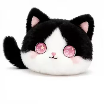
Before adding details, reduce the artwork to a solid outline. If the shape still feels recognizable, the concept has a useful foundation. If it becomes a generic oval, the identity depends too heavily on the face and color. Ears, tufts, limbs, a curved body or an unusual pose can provide recognition without making production unnecessarily complex.
Pink Is a Family of Colors, Not One Specification
Soft blush, dusty rose, coral pink, candy pink and magenta create very different impressions. A screen rendering can make them appear cleaner or brighter than the real fabric. The pile direction and surface sheen also change how the shade looks under store lighting and photography.
For brand projects, compare physical swatches with packaging, logo colors and nearby products. A Pantone reference can guide the conversation, but final approval should use the chosen material. The same color reference may look different on short plush, velboa and a longer, softer pile.
Consider whether the character needs one consistent pink or a controlled combination. A lighter face panel can improve expression. Darker accents can define limbs or accessories. Too many close shades may look accidental, while one flat shade can make the body lose depth. The best palette gives important features enough contrast without turning the toy into a patchwork.


Fabric Changes the Personality
Material is not only a cost item. It determines how the buyer first understands the product. Short-pile plush tends to hold a clean outline and keeps embroidery readable. A smoother low-pile fabric can feel graphic and modern. A longer pile feels fluffy and comforting, but it can hide small stitches and soften the edges of the pattern.
Ask what the product needs to do. A promotional mascot may prioritize logo visibility, repeatable color and efficient packing. A gift product may prioritize hand feel. A story or interactive plush may need defined areas for buttons, speakers, sensors or access points if those functions are part of the approved specification.
Request a labeled swatch or keep a signed sample reference. Descriptions such as "super soft" are subjective. A repeat order should refer to a material record, not a memory. Also check the backing and stretch. Two fabrics can feel similar on the surface but behave differently when embroidered, sewn or filled.
The Face Is a System of Small Measurements
Faces are often reviewed emotionally-"more friendly," "less sleepy," "a little happier." Those comments are understandable but difficult to reproduce. Translate them into measurable changes. Mark the eye spacing, distance from a center seam, mouth width and cheek position. Use the approved embroidery file as a controlled reference.
Long pile may cover thin lines. Dense embroidery may pull the fabric and create puckering. Very small highlights can fill in during stitching. A sample should be reviewed at normal viewing distance as well as close up. The goal is not to preserve every pixel of the illustration; it is to preserve the expression in textile form.
Safety and durability also favor thoughtful surface details. Embroidery can provide a flat finish for eyes and mouth elements. Any alternative component must be evaluated for the intended market, age group and final product design. Do not assume a construction is appropriate because it appeared on an unrelated sample.


Stuffing Controls Shape, Balance and First Impression
A character can use the correct pattern and still look tired if the filling is uneven. Underfilled areas create wrinkles, weak corners and inconsistent proportions. Overfilling can harden seams, distort the face and reduce the soft hand feel buyers expect.
During sample review, press around the entire body. Check narrow sections, limb connections and the area behind embroidery. Look at the toy standing, sitting, lying flat and viewed from the side. A front photograph alone can hide a collapsed back or unstable base.
If the product must sit upright, state that as a functional requirement. The base pattern, center of gravity and filling distribution need to support the pose. A toy that balances only when carefully arranged for a photo is not ready for a retail shelf.
Small Details Should Earn Their Place
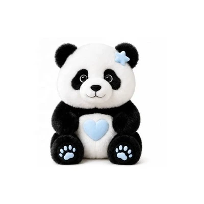
Bows, clouds, stars, wings, tufts and hanging loops can make a pink character more distinctive. They also add seams, attachment points and packing considerations. Each detail should support the story or use case. Decorative parts added only to make the artwork look busy often become the first elements buyers remove during cost review.
Check how people will handle the toy. A top accessory may become an unofficial carrying handle. Long limbs may be pulled or folded in the carton. A delicate edge may curl after packing. Ask the sample team to consider real use rather than only the appearance on the table.
Branding should also feel integrated. A large logo embroidered across a curved body can distort the character and may not remain legible. A woven label, small embroidery position, hangtag or packaging panel may communicate the brand more cleanly. Reserve the location early instead of adding it after the sample is finished.


Interactive Features Need Their Own Brief
Some pink plush concepts are intended as simple soft toys; others may include sound, light, recording, buttons or digital interaction. These functions should never be implied from artwork alone. They affect internal layout, materials, access points, testing, labeling and packaging.
Define the user action and response. What does the user press, touch or scan? What happens next? How is the function powered? Can the module be accessed? Which markets and user groups are intended? A clear user flow is more useful than a list of fashionable technologies.
If the electronic idea is still being evaluated, mark it as optional. The supplier can then discuss whether the body design should allow a later version without presenting an unconfirmed function as part of the current product.
What to Include in the First Development Brief
| Brief item | Why it matters | Useful reference |
|---|---|---|
| Use case | Guides construction, hand feel and packaging priorities | Retail gift, mascot, promotion or interactive concept |
| Target market | Supports compliance planning and labeling | Destination countries and intended users |
| Size and pose | Controls pattern proportions and shelf footprint | Height, width and front/side artwork |
| Color direction | Prevents broad interpretation of "pink" | Physical swatch, package sample or approved reference |
| Fabric preference | Affects outline, touch and embroidery | Short pile, smooth surface or fluffy hand feel |
| Branding | Reserves a practical position and process | Logo file, label artwork or hangtag design |
| Required features | Changes internal structure and testing | Mark each feature required, optional or future |
| Packaging | Affects recovery, display and carton planning | Bag, box, gift set or open retail display |
A reference board can combine several images, but label what each image contributes. One may show the preferred shade, another the face and another the pose. Without notes, the development team may copy the wrong element or assume every detail is required.

Review the First Sample in the Right Order
Start with the biggest decisions: overall dimensions, silhouette and pose. Next review the face, material, accessories and branding. Finish with smaller refinements. Correcting the embroidery before the body shape is stable wastes time because later pattern changes may move the face again.
Use numbered comments and marked photos. Replace "make it slightly softer" with a comparison to the approved swatch or sample. Replace "move the eye up" with a measured change from a stable seam. Keep the version number visible so old comments do not return in the next sample.
Approval should identify the complete reference: pattern version, material, color, embroidery file, filling level, accessory method, label position and packaging direction. A message saying only "looks good" does not provide enough control for later production.
Packaging Can Protect or Damage the Design
Compression may reduce carton volume, but a fluffy pink character can arrive with a flattened face, folded accessories or uneven filling. Test the real packing arrangement and review the toy after unpacking. Consider recovery time and whether the end customer will understand how to reshape it.
For e-commerce, the item should remain clean and easy to identify. For retail, the packaging should not hide the face or key accessory. Barcodes, warnings and brand copy need clear positions. If the character belongs to a collection, consistent package dimensions can improve merchandising even when body shapes differ.
Quality Control Should Protect the Character's Expression
Inspection should cover more than open seams or stains. Eye spacing, mouth angle, accessory position and body fullness determine whether the approved personality survives production. A toy can be technically complete and still feel wrong when these visual relationships drift.
A project-specific checklist may include overall dimensions, color, seam appearance, embroidery placement, attachment security, cleanliness, filling distribution, label position, agreed functions and packing method. Tolerances should reflect soft materials and the approved sample, not demand unrealistic mechanical precision.
Compliance evidence should relate to the actual design, materials, market and intended users. Generic documents from a different toy do not replace project-specific planning. Buyers should provide destination information early and confirm what documentation is needed for the final product.

How to Keep a Pink Collection from Looking Repetitive
A family of characters can share eye style, limb proportions or label treatment, but each product should keep a distinct silhouette and story. Changing only the color creates weak merchandising and repetitive website content. Give each character a role, shape or accessory connected to the campaign.
For search visibility, this matters as much as it does for design. Helpful pages answer different buyer questions: material selection, sampling, quality control, interactive planning or packaging. Repeating the same article with a new color provides little value to customers and little reason for a search engine to prefer the page.
FAQ
Q: Buyer FAQ
A: Can development begin from a sketch?
Yes. A sketch can start the review, although additional views, dimensions and brand references may be needed before pattern and embroidery details are finalized.
Q: Can the pink color match our packaging?
A: The team can review material against a supplied reference. Final approval should use the actual fabric or sample because screen color and pile direction can be misleading.
Q: Can we add a logo without changing the character's face?
A: Yes. Embroidery, woven labels, hangtags and packaging offer different options. The best position depends on body curvature, logo detail and desired visibility.
Q: Can sound or light be added?
A: Interactive functions can be evaluated when they are part of the brief. The exact construction and testing depend on the approved user flow, power method, market and product specification.
Q: What information is needed for a quotation?
A: Provide artwork, approximate size, quantity range, target market, use case, material preference, branding, packaging and required functions. Price, MOQ and lead time should be calculated from confirmed specifications rather than generic promise

A Better Starting Point
The most memorable pink plush characters do not rely on pink alone. Their shape, face, touch and purpose support one clear personality. Before asking for a final quotation, decide what the character should communicate and where customers will meet it-on a shelf, in a gift box, at an event or inside an interactive story.
XINDITAI supports custom plush and interactive toy development for brand projects. Share your artwork, intended market and use case, and the team can review the structure, materials, branding positions, optional functions and sampling questions that need to be resolved before production planning.