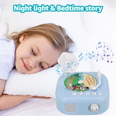
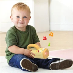
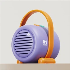
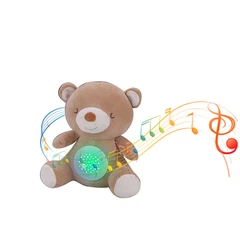
Color isn't just an aesthetic detail in the toys & gifts industry-it's a competitive differentiator, a brand signature, and sometimes a source of endless frustration. Recently, a project combining plush and plastic in one product forced our team to revisit an age-old industry debate:
Why do we default to Pantone C for ABS plastic and Pantone U for textiles? Are we clinging to tradition, or is there real science behind this?
Click here to see all Pantone U series: https://www.qtccolor.com/secaiku/dir/2
Click here to see all Pantone C series: https://www.qtccolor.com/secaiku/dir/1
🛠️ The Technical Truth: Why C for Plastics, U for Fabrics?
Let's get technical for a moment-because real innovation in our industry starts with understanding the "why," not just the "what."
Pantone C (Coated):
Surface: Designed for glossy, coated surfaces (like magazines, packaging, and-yes-plastics).
Color Appearance: Produces brighter, more saturated colors because the coating prevents ink from soaking in, reflecting more light.
ABS Plastic: Injection-molded ABS has a naturally smooth, shiny finish, so Pantone C gives the truest preview of final appearance.
Pantone U (Uncoated):
Surface: Made for matte, absorbent surfaces (like uncoated paper or most textiles).
Color Appearance: Colors appear softer and less vibrant, as the substrate absorbs more pigment and scatters light.
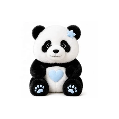
Textiles/Plush: Fabrics and plush toys are inherently matte and absorbent, so Pantone U matches real-world results.
📊 Quick Comparison: Pantone C vs Pantone U in Toys & Gifts

C vs U
🚦 But Here's the Controversy…
With hybrid products and new material innovations, is this binary approach still serving us?
What about fabric with special coatings, or plastics with matte finishes?
How do we handle sustainable or recycled materials, where surface properties are unpredictable?
Are we communicating clearly enough between design, engineering, and production-or just passing the Pantone number and hoping for the best?
Real-World Headaches:
Ever matched a Pantone C on a plush toy, only to end up with a washed-out, disappointing result?
Or used Pantone U for a plastic part, then wondered why it looked so flat and lifeless on the shelf?
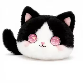
Hybrid toys (think: plush + ABS eyes, or fabric + hard shell) can become a color-matching nightmare if the team isn't aligned from the start.
💡 My Take: Nuance Matters More Than Ever
As our industry evolves, so should our approach. Relying on "C for plastic, U for fabric" is a good baseline-but it's not a substitute for technical communication, cross-team collaboration, and, frankly, a lot of testing and prototyping.
Let's challenge ourselves:
Are we stuck in a rut, or are we actively learning from each project?
How can we improve the color-matching process for the next generation of toys and gifts?
Who's leading the charge with new solutions, and what can we learn from them?
👇 Join the Conversation!
I want to hear your stories:
Color horror stories? Lessons learned?
Do you see value in breaking the C/U mold?
How do you build bridges between design, engineering, and production in your organization?
Drop your thoughts, experiences, or even your color fails below! Let's push the industry forward-together.
#ToyIndustry
#GiftIndustry
#ProductDesign
#ColorMatching
#Pantone
#MaterialScience
#Manufacturing
#SupplyChain
#DesignEngineering
#CMFDesign (Color, Material, Finish)
#InnovationInToys
#HybridDesign
#SurfaceFinishing
#QualityControl
#ProductionChallenges
#ColorScience
#IndustrialDesign
#ConsumerProducts
#BrandConsistency
#TextileDesign
#PlasticEngineering
#CrossFunctionalTeams
#DesignToManufacture
#Prototyping
#IndustryBestPractices
#RAndD
#ProductDevelopment
#Trendspotting
#SustainableDesign
#ColorTrends