The Colors Were Assigned, Then Reversed
The pink-and-blue rule that feels ancient is less than a century old, and it started upside down. 📉
In 1918, Earnshaw's Infants' Department advised that pink -- being a more decided and stronger color -- was more suitable for the boy, while blue, being more delicate and dainty, was prettier for the girl. A 1927 survey of American department stores found the same split: most retailers recommended pink for boys.
The reversal happened in the 1940s and 1950s. Post-war consumer culture, mass-produced children's clothing, and marketing departments standardised the switch. By the 1980s, prenatal testing made it possible for parents to learn a baby's sex months in advance -- and the gender-coloured shopping spree that followed locked the convention in place for a generation.
Read that sequence again. The rule was invented, reversed, and then hardened by technology and retail. It was never a natural law. It was a marketing decision that outlived its makers. 🎯

Why Pastel Is Winning in 2026
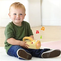
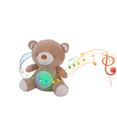
Walk any toy aisle today and you can see the shift. The loud primary colours of the 1990s -- the reds, blues, and yellows of the classic learning-toy era -- are being pushed to the edges. In their place: dusty pink, soft blue, warm yellow, sage, cream, and oatmeal. 🧸
Four forces are driving it.
Parents buy for their own taste. The person choosing a toy at 11 PM on a phone is an adult with a living room. Toys that look like a Nordic nursery sell better than toys that look like a carnival.
The home is the shelf. With bedrooms, playrooms, and living spaces doing triple duty, a toy that clashes with the interior does not get bought twice. Soft colourways photograph better in a home, and home is where the purchase decision happens.
Social media changed the aesthetic benchmark. A parent scrolling through a feed of beige interiors and pastel nurseries does not then buy a fluorescent green dinosaur. The reference point moved, and product colours moved with it.
Soft does not mean gendered. Pastel lets a brand offer three colours without labelling any of them for a boy or a girl. That single design choice is now a commercial advantage, not just an ethical one. ✅

The Three-Colour SKU, in Business Terms
Here is the part buyers learn the hard way. Adding a colour sounds like a paint decision. It is a supply chain decision. 📊
What does not multiply: the tooling. One mould, three colour masterbatches, three finished SKUs. You do not pay for a second injection mould because a customer wants yellow.
What does multiply:
Packaging -- three box versions, three labels, three sets of print plates
Inventory -- three SKU positions instead of one, with three separate demand forecasts
MOQ exposure -- if the minimum run is 1,000 pieces, three colours means committing to 3,000, or splitting the line three ways
Forecast risk -- you will guess wrong on at least one colour, and the wrong guess becomes dead stock
That last point is the one that costs money. A three-colour launch looks like a marketing win and behaves like a forecasting bet. The colour that sells out first is never the one you ordered most of. 🔍
How experienced buyers handle it: they launch one or two colours first, read the sell-through data for a season, then add the third once they know which one the market actually wants. The tooling is already paid for, so the second wave is cheap. Patience is the discount.

The End of "For Boys" and "For Girls"
Retail has been moving faster than most manufacturers realise. 🔑
In 2015, Target announced it would stop separating toys by gender in its stores -- removing the pink and blue aisle signage and the "boys" and "girls" labels from toy sections. In 2017, John Lewis removed "boys" and "girls" labels from its children's clothing. Other retailers followed in categories where the signage had become a liability rather than a wayfinding tool.
Three practical consequences for product design:
Labelling shifts to attributes. Not "for girls" but "for ages 3 and up," not "boys' version" but "blue colourway"
The gift purchase gets easier. When a toy is not gendered, an aunt buying a birthday present does not have to guess -- which widens the buyer pool for a single SKU
Colour becomes strategy, not segregation. Three neutral colourways let a child choose their favourite instead of being assigned one
The commercial logic is simple. A gendered product divides your market in half. An ungendered product sells to all of it. 🎨

What This Looks Like on a Real Product
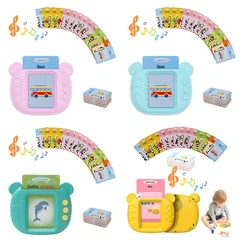
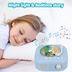
Our ICARE FAMILY Story Player is a record-player-shaped story machine -- music, learning, and a soft night light in one unit. When we planned the colourways, the brief was "three soft colours, no gender label." ✅
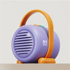
Pastel pink, pastel blue, and pastel yellow. Three SKUs, one mould, one set of electronics, one story card system. The retail copy says what the product is for -- ages 3 and up, bedtime, learning -- and never who it is for. 😴
The packaging tells the same story. One box design with three colour variants, gift-ready, with the colourway printed where a buyer expects to find a specification rather than an instruction. That is deliberate. A parent shopping for a nephew should never have to check a gender label to decide.
And if a distributor asks for pink-and-blue-only, we can build that -- the tooling does not change. But we will ask the question first, because the answer often depends on the market. In northern Europe, a pastel three-colour line outsells a gendered one. In other markets, the reverse is still true. The data should decide, not the habit. 📈
The Common Thread
Toy colour is not decoration. It is a market decision wearing a paint job. 📉
The pink-and-blue rule was invented in 1918, reversed in the 1940s, and hardened by prenatal testing in the 1980s. It has been unwinding since 2015 in retail, and it is unwinding faster in 2026 because parents are buying for their homes and their own taste, not for a label someone else assigned.
For a brand planning next year's line, three questions decide more than any mood board:
Which colourways will sell, and which will sit in the warehouse?
Does any colourway require a gender label to make sense? If yes, why?
Can we launch with fewer colours, read the data, and add the winner later?
Get those right and colour stops being a design debate. It becomes a forecast you can defend. 🎯

If You Are Building a Smart Toy Right Now
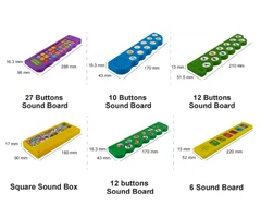
We design and manufacture educational audio toys -- story players, flash cards, plush, projectors, sound books, and RFID story boxes -- with full colour and packaging customisation. One mould, multiple colourways, Pantone matching from MOQ 1,000.
We are XDT, an educational and AI toy OEM/ODM factory in Shenzhen. Established in 2010. 20,000+ customers served. 120+ countries shipped. ISO90001, BSCI, SEDEX, CE, FCC, ROHS, UKCA, EN71, CPSIA certified.
If you are planning colourways for 2027 and want a view on what actually sells, message me. We will show you the sell-through patterns from our own customers, not a colour wheel.
Official Website: www.kidsoundbook.com | www.xinditai.com
Email: happy@xinditai.com WhatsApp: +8613824343309
Let Me Hear From You
Buyers: how many colourways do you actually launch, and how often do you get the mix wrong? 📊
Designers: has a retailer ever told you to make a product less gendered? What happened to the sales?
I read every comment. The best colour decision I ever made was dropping a fourth variant before launch, and the buyer who argued for it still brings it up.
#ToyIndustry #ProductDesign #ColorStrategy #ToyOEM #KidsToys #Manufacturing #Sourcing #OEMsolutions